Just how important is the baseline grid and does it have any relevance on the web today?
In the words of Robert Bringhurst who wrote The Elements of Typographic Style (many designers’ typography bible.): the main text should also return after each variation precisely on beat and in phase.
This makes absolute perfect sense and is a given in the print world. The first thing many designers do when setting up a new document in InDesign is to create their baseline grid and select the option for everything to align to it. This is especially important when there is more than one column of text. Imagine a newspaper where the lines of text in adjacent columns didn’t line up:

Or

Ugly!
So what about on the web? After all, it’s rare to have multi-column layouts at this moment.
Another famous quote from Bringhurst is:
“Space in typography is like time in music. It is infinitely divisible, but a few proportional intervals can be much more useful than a limitless choice of arbitrary quantities.”
Grids, whether typographical or not are a tool. They can stop designers making arbitrary decisions but it doesn't stop there. Designing with a vertical rhythm gives the text a structured feel. Besides, although the page might only have one column it might contain asides, pull quotes, navigation, figures or anything else that would benefit from this technique.
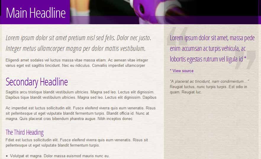
You can see this in action on this very website from some of the early design mock-ups:
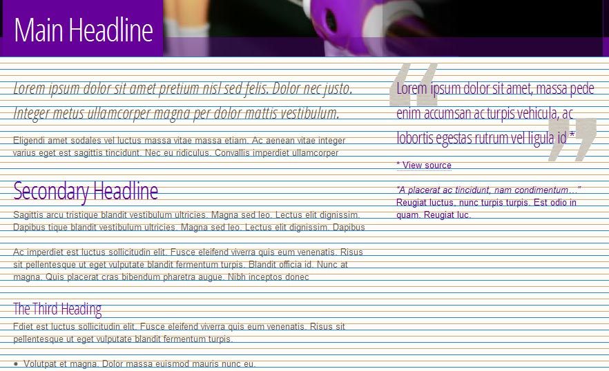
Technically, this is quite difficult to achieve and there are lots more downfalls and issues that get thrown up. That goes beyond the scope of this post but is something I plan to write more about soon.
All articles Copyright CST Group Limited ©1997-2026
Let's Talk
Whether you have a new or existing project, we’d love to hear from you.
Our experienced team thrive on problem solving and working with your business goals in mind.