Marston’s EPA recently updated its branding so we were tasked with redesigning the website to reflect the great new look.
As more and more people are looking at websites on their mobile devices and the stats for the website backed this up, this seemed like an ideal time to evaluate the site’s mobile strategy.
We didn’t want to create two separate web addresses (e.g. marstonsepa.co.uk and m.marstonsepa.co.uk). There has been much debate recently about whether separate addresses can harm SEO and Google is recommending that each URL serves the same HTML to all devices.
We also didn’t want to create two separate websites. Doing so can be harder to maintain. Also, if creating a specific “mobile” website, how can you define mobile? You could run the risk of tablets receiving a mobile view and not taking advantage of their screen size. And besides, mobile sites are so last decade!
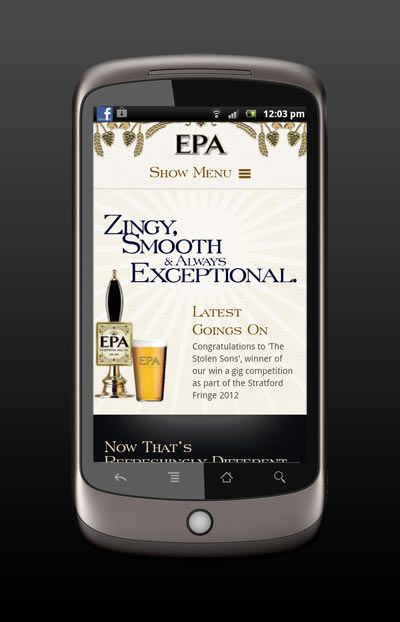
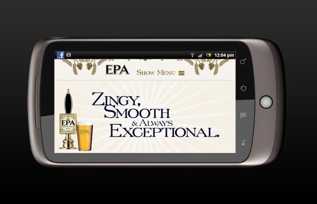
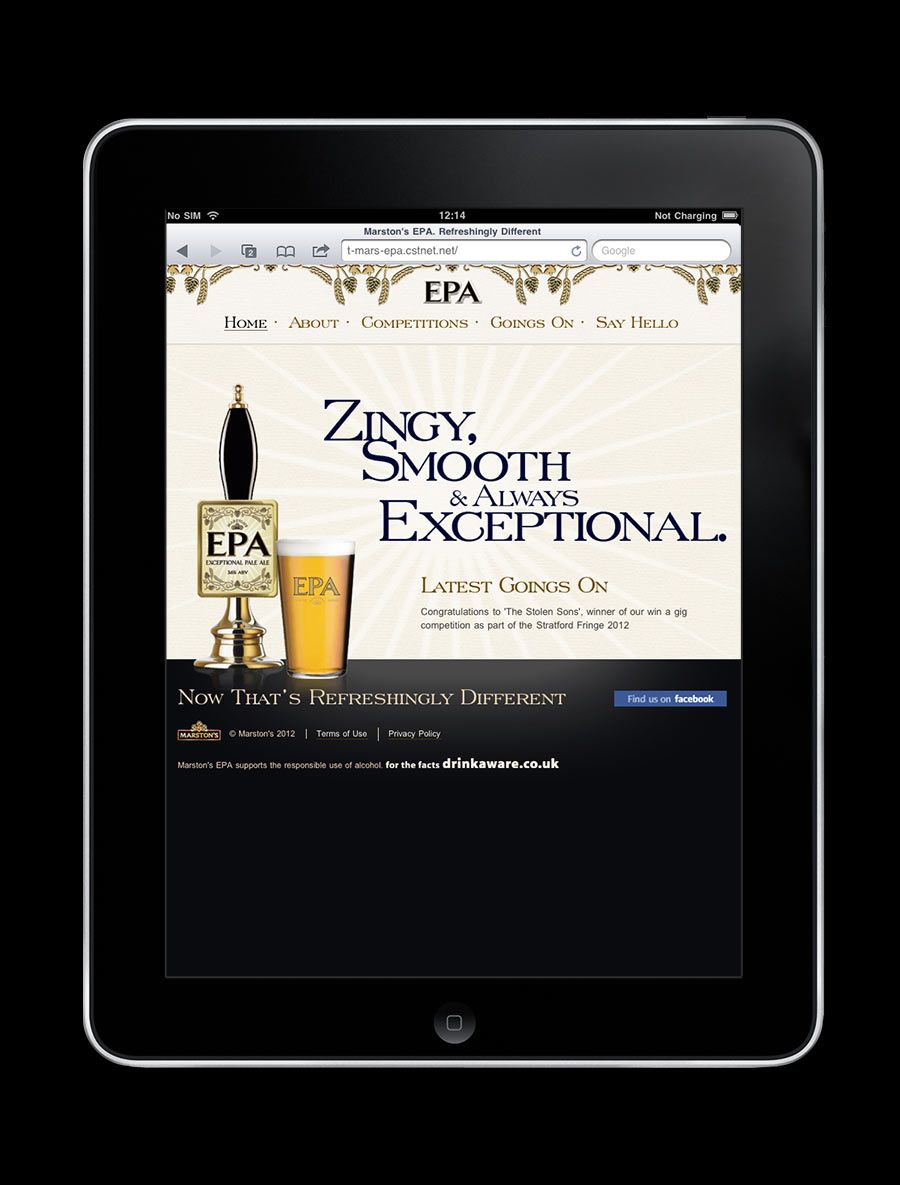
It’s for these reasons that we decided to build the website using “Responsive Web Design”. In simple terms this means that the layout of the website responds dynamically to the different screen widths of various devices. It’s exactly the same content but the CSS changes depending on the screen size. So for example, you could have a page with two columns that on a device with a narrow screen changes to a one column layout. There’s an added bonus too in that the site looks better on desktop browsers because it’ll always make best use of the available space: If someone narrows their browser window the site will adapt to this, rather than showing horrible horizontal scroll bars.
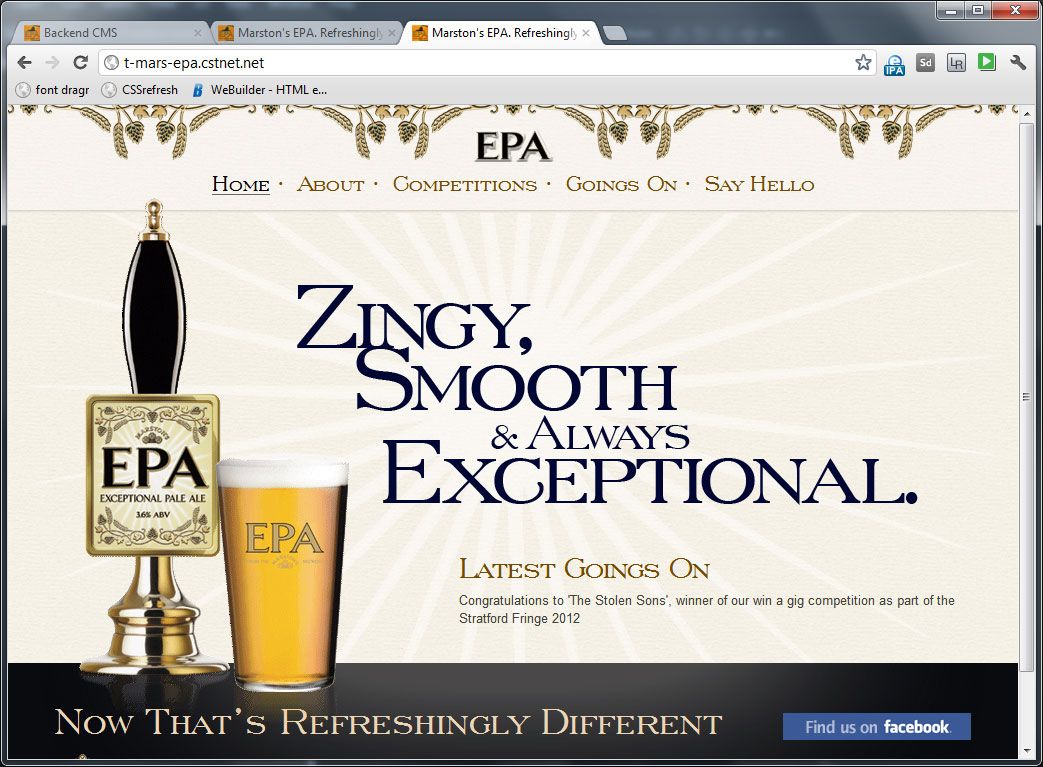
You can see all of this in action in the following screen shots and on the Marston’s EPA website. I hope you like the website – maybe it’ll even inspire you to try a pint of the lovely beer!
It’s obviously much more complicated than that, and I’m planning on going through some of the technical challenges on this website at a later date.
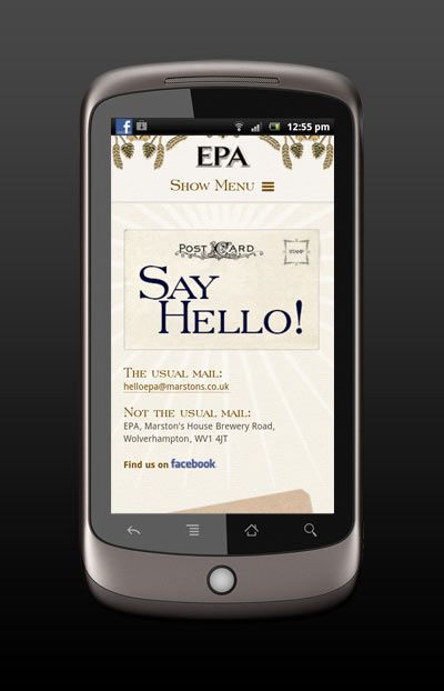
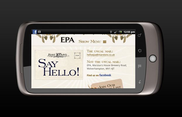
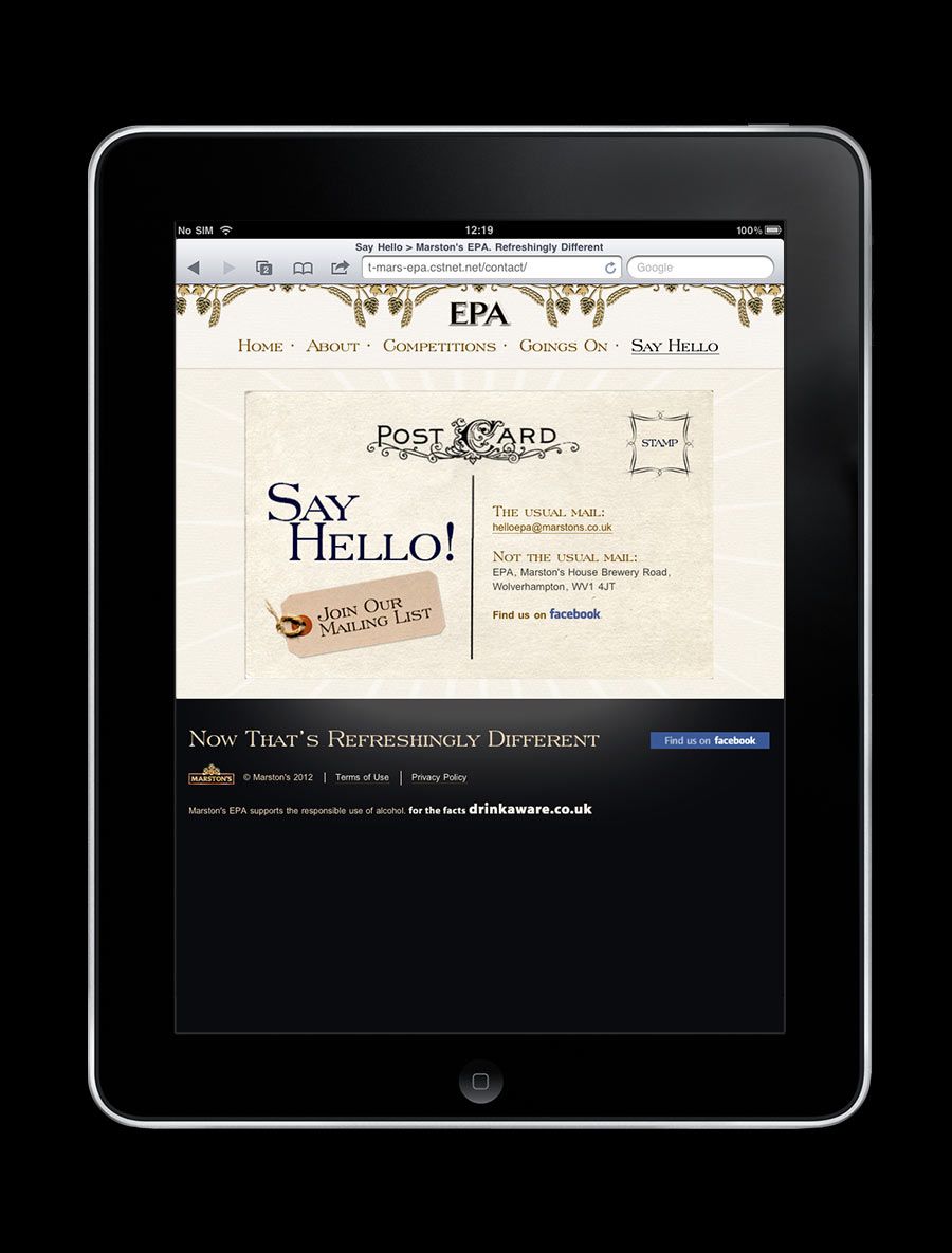
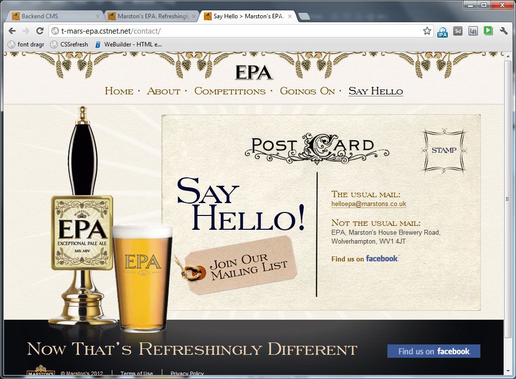
Screen Shots
Below you can see some screen shots of this in action. Click on them to see the individual versions:
Home page
Contact page
All articles Copyright CST Group Limited ©1997-2026
Let's Talk
Whether you have a new or existing project, we’d love to hear from you.
Our experienced team thrive on problem solving and working with your business goals in mind.