If you look back over our previous journal entries you might note a couple of recurring themes: Websites that are ranked highly by Sitemorse, and Responsive Design.
With this latest journal entry we can bring those subjects together, because we’ve just rebuilt the Marston’s corporate website so that it’s now fully responsive, adapting its layout, navigation and content to suit various screen sizes. And at the same time, Sitemorse has just ranked the site as the best for any company within the FTSE All-Share index, once again.
Sure, we’ve sat at the top of the Sitemorse survey several times before, but never with a responsive site. It’s not easy to build a site which adapts to things like smartphone and tablets whilst maintaining the highest levels of accessibility and code standards – that’s why, if you work your way through the top 30 sites of the 500-odd tested by Sitemorse, only one other is properly responsive.
Using the new Marston’s website as an example, I’d like to explain why “responsive design” takes expertise and experience to get right.
The “In-Betweeny” Bits
It’s easy to think of a responsive design as three designs that look good on mobile, tablet and desktop. However, with the plethora of devices being used all with different screen sizes it becomes impossible to know where the mobile design should become the tablet design and the tablet design should become the desktop design. It’s best to avoid a situation where for example we build a website to suit the iPhone dimensions exactly, only for Apple to bring out a new iPhone with a different screen size (which has already happened with the iPhone 5). So instead of thinking about screen resolutions we build our websites to be device agnostic –choosing where our designs change based on the content not on the device. Another way of thinking about this is that we’re building a design system that works across different screen widths, not three different websites for each device.
Deciding What’s Important
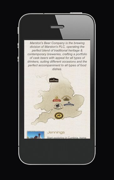
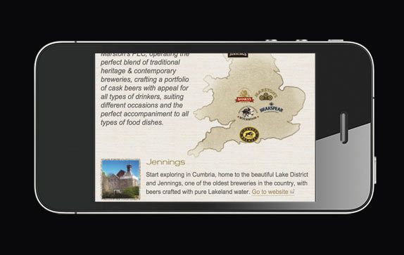
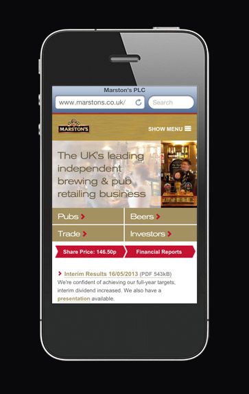
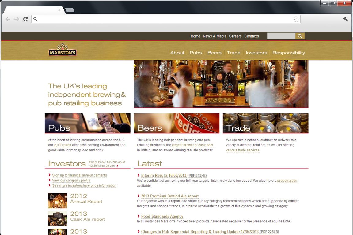
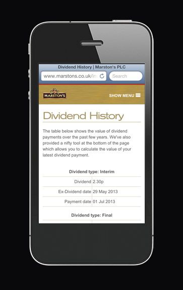
With less physical space on smaller devices, it makes sense to try and keep the amount of content shown on any page down to a minimum. On the home page we remove anything that could be found elsewhere on the website. For example, on larger screens there are links to each individual financial report as there is enough screen space. On smaller screens where space is limited, there is a clear link to the financial reports page that lists all the reports, but all the individual links are removed. Not only does this make the home page less cluttered on a smaller screen it allows us to show more content without scrolling such as the latest news.
Making Sure Mobile Users Can Still Access Content
You’ll notice above that the content is still available – it’s just different from what’s shown on larger screens or is available in easy to find places elsewhere on the website. We never assume that just because someone has a small screen device that they don’t want the same content as those using larger screens. There is a balance that needs addressed.
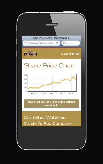
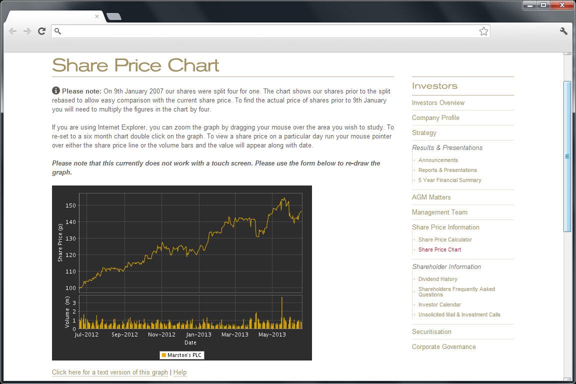
On the “Investor Chart” pages we needed to embed a tool from a 3rd party web service that we felt wouldn’t work well on a smaller screen. One of the reasons was that physically there wasn’t enough room to accommodate all the data points. For this we created a much simpler chart with less data points and a link to the raw data so the content was still accessible.
One advantage of this was that the simpler chart was much quicker to download due to the file size being smaller and the code simpler. We didn’t just hide the big chart on the big screen (which would mean that the end user downloads both charts) we detect the screen size and show the appropriate chart.
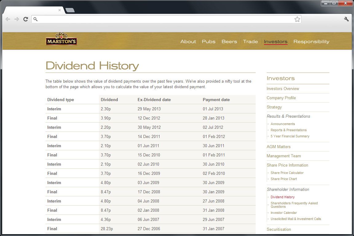
Tables
A table with more than two columns would likely be larger than the width of the screen on a mobile. To get around this we’ve used Javascript to re-arrange tables to adapt to the screen size.
Hit Areas
It’s hard to touch links on a touch enabled device when they are too small or have other links in close proximity. This website has lists of links to reports with plenty of space that make it easier to touch the correct one.
Video
Video is often added to websites as an after-thought so is often a fixed height and width. Any videos on this website will fit the width of its container and re-size keeping its original dimensions in place.
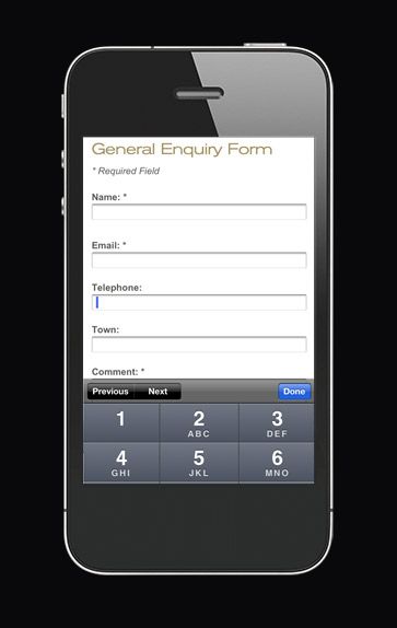
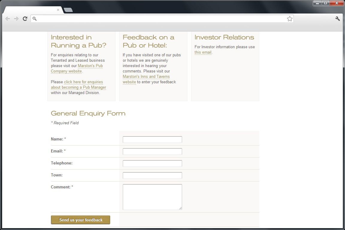
Forms
Filling out forms on a small screen device (especially with a touch screen) is made easier by making the form elements as wide as the screen width allows on smaller screens and keeping them in one linear column. We’ve also utilised HTML5 inputs so that if for example a phone number is needed to be entered on a touch screen, the device brings up the numerical keyboard straight away.
Retina/High Density Displays
On high resolution devices such as the iPhone graphics can look blurry. This is especially true for icons. To get around this we’ve used scalable icons embedded in web fonts that look crisp at all sizes on all displays. We also made sure that the technique used for embedding the main headline font looked great on these devices.
Minifying/Optimising
Design isn’t just things you can see. It’s the whole experience and the speed of the website is a huge part of this. We’ve obsessively optimised our images and files as well as concatenating our files to create less http requests. The average website page weight has now hit nearly 1.5mb whereas Marston’s PLC is less than a 10th of that. The average number of requests is around 90 where as we use 15.* All this has meant a very quick to load website!
* Page weight / request statistics taken from httparchive.org/reports/state-of-the-web
All articles Copyright CST Group Limited ©1997-2026
Let's Talk
Whether you have a new or existing project, we’d love to hear from you.
Our experienced team thrive on problem solving and working with your business goals in mind.